 Sean Jackson
Copyblogger Sean Jackson
Copyblogger |
This will be the first part of a series of blog posts helping SMBs discover and implement important elements to make a successful website. I decided to split the blogs due to the overwhelming amount of information surrounding this topic. Today, I would like to focus on which components make a successful website. The follow up blogs will be a more granular approach regarding each element and how SMB’s can, and why they should, incorporate these elements into a website. |
This will be the first part of a series of blog posts helping SMBs discover and implement important elements to make a successful website. I decided to split the blogs due to the overwhelming amount of information surrounding this topic. Today, I would like to focus on which components make a successful website. The follow up blogs will be a more granular approach regarding each element and how SMB’s can, and why they should, incorporate these elements into a website.
Here are a few of the elements that will bring value to customers and enhance the website:
Content is King
I believe that quality content is the singular most important feature of a website. Though the aesthetic appeal can seem to be an essential element that deserves significant focus, and it does deserve attention, the first step in creating a successful site is knowing what content will appeal to the user. When a customer lands on a business site, their first question tends to be, “Is what your saying going to benefit me and my needs?” Customers come to websites for two reasons, to seek out more information about something they’re already aware of, or because they organically stumbled onto the site and are interested in their first impression of it. Regardless of the reason the website was visited, the customer will need to have a clear understanding of what the business provides. The next step is supplying a path where customers should go next to learn more, which is where back-linking comes into play. It is often the case that businesses use tabs to direct users, but back-linking is a more efficient way to steer users throughout the site – this is where aesthetics overlap content, bringing us to our next point.
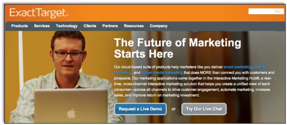 Take this snapshot for example. ExactTarget, a provider of email, mobile and social media marketing, has clearly stated its services and provided a reason why the user should want to learn more.
Back-linking
Websites prefer to use tabs like, “about us” “contact us” and “blog” because the tabs were originally the breadcrumbs set by the company for users to find their way through the site. However, back-linking is a more natural way for users to navigate a site. Business should link to relevant keywords that have landing pages associated with them. So when a customer wants to learn more about that specific offering or concept, all they need to do is click on the link, rather than scroll through each tab trying to find the correct content. Don’t get me wrong, the tabs are still useful, and can be implemented for users who want to go directly to the “about us” page on a company site. Back-linking will make the user more comfortable and provide a better experience on the site.
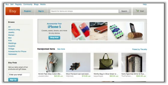
The Small Business e-Commerce site Etsy uses hyperlinks on the side bar while still maintaining tabs up at the top for users to click on as well.
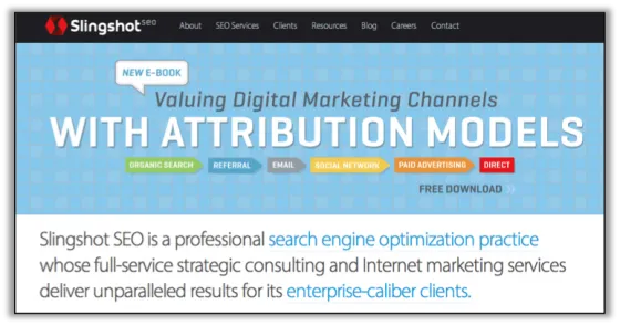
Another example is Slingshot SEO’s site, which also features highlighted links within the page’s content, rather than on the side. This tactic makes it easy for customers to click on the service they wish to learn more about.
Aesthetics
Aesthetics do hold their own place within website design. One key to ensure successful conversion is a clear call to action. What does the SMB website want the customer to do? If the CTA is evident customers will know to move forward in that direction. Try and think outside of the box, instead of the CTA asking customers to “click here to speak with a sales representative” think about pushing the customer towards a demo, or more information. By showing the customer that the business is more invested in providing them with answers to their questions, offering solutions to problems, and focusing on the customers needs rather than attempting to sell them, the customer will in turn feel as though the company is an expert in their industry, cares about them as a customer and wants to help them rather than just sell them a product. Customer loyalty is increased, and website traffic tends to increase. Customers will turn to the site for answers, because they can find them easily and they see the business as an authority.
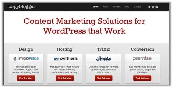 Copyblogger’s site has four independent Call To Actions. Each CTA makes it very clear for the customer to understand which path they should take to find the desired information.
Search Engine Optimization
SEO encompasses all of these – search engines want websites that load fast, are easy to navigate, have a clear message, and use keywords that will help users find the information quicker. But the most achievable SEO tactic is adding focused keywords, including long tail and semantic, which will make it clear to users (and bots) what the site is about. If a website caters the content towards users, they will ultimately be catering the content for the bots who scan the site. After all, Bing and Google’s objective is to provide ‘worthy’ content within the first result, so if businesses are explicit within the site both the bots and the users will be satisfied.
A Blog
Many people are confused with this term. A blog doesn’t mean that same thing it meant 15 years ago, when it acted as someone’s online journal. A blog should be thought of in terms of a resource center and positioned as such. A business should add a blog to their site in order to help customers find answers to the problems they seek. For example, if your SMB offers HVAC services you may want to offer content that tells customers how to troubleshoot before calling a service representative. Providing this information could save the customer money on a service call; and, positions you, the SMB, as an expert. It also demonstrates that your SMB cares about its clients, not just the money involved.
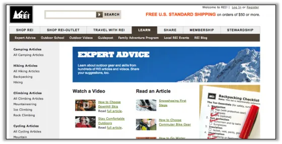 REI’s resource center is the perfect example of a business trying to reach out and help its customers. The blog provides videos and tutorials as well as how-to posts and checklists.
These are the components of a successful website that will drive conversions and offer users the information they truly seek. The next part of the series will delve into how businesses can create compelling content for their site, how to search for keywords, and how to build out pages within a site to ease navigation and improve user experience.
Check back next Tuesday for part 2 of this series
Sean Jackson on Google+
 Sean Jackson
 Take this snapshot for example. ExactTarget, a provider of email, mobile and social media marketing, has clearly stated its services and provided a reason why the user should want to learn more.
 The Small Business e-Commerce site Etsy uses hyperlinks on the side bar while still maintaining tabs up at the top for users to click on as well.
Another example is Slingshot SEO’s site, which also features highlighted links within the page’s content, rather than on the side. This tactic makes it easy for customers to click on the service they wish to learn more about.

 Copyblogger’s site has four independent Call To Actions. Each CTA makes it very clear for the customer to understand which path they should take to find the desired information.
 REI’s resource center is the perfect example of a business trying to reach out and help its customers. The blog provides videos and tutorials as well as how-to posts and checklists.
These are the components of a successful website that will drive conversions and offer users the information they truly seek. The next part of the series will delve into how businesses can create compelling content for their site, how to search for keywords, and how to build out pages within a site to ease navigation and improve user experience.
Check back next Tuesday for part 2 of this series